
Responsive web-based application
with open connectivity that helps manage Point of Care Testing from a single location.
The challenge
Being built on top of the back-end of the old solution, with time and budget constraints, the project was facing the following challenges:
• Transition of a well-established product into a UCD-based, modular solution to a cross platform experience in the new era
• Information was not structured based on the needs of the user
• Deliver the best experience for the user given the constraints (time and technology limitations)
Skills
Interaction design / Visual design / Information architecture / Wireframing / Prototyping / Soft skills / Usability testing / Documentation
Tools

Project team and setup
In the pre-development phase, UX Team had iterative meetings with the International Product Manager for the refinement of the concepts.
The project was developed in an Agile environment, following the Scrum framework while the UX Team was involved in all the ceremonies around a sprint.

My role - transitioning from UX/UI intern to UX Lead
Given the fact that this is a multi-year product, with several releases, my role in the project evolved over time from an internship position to being the UX Lead of the project. My role involved participating in all activities, end-to-end, from alignment to delivery with a focus on interaction design and creation of user interface. Over the course of the project, I was involved in the following activities:
• Analyze the current workflows
• Usability testing
• Workflow creation and optimization
• External agency for the implementation of the project management
• Stakeholder management
• UI kit creation and development alignment
• Documentation
• 3 patent creation that were accepted by the innovation board and are in the process of being filed
Discover and analyze phase
This web-based application is the successor of a line of products in the Point of Care IT area. Research was done prior to my involvement in the project and the deliverables created as a result (personas and customer journeys) helped us build empathy with the user’s needs and made us aware of the pain points that we had to address in the creation of the workflows.
In the process of concepting this application, it was important to transfer good things from user-centered companion apps of the old system and bring them into the main application thus forming the core of the way the new system would be structured. The original user study from 2014 with 42 interviews and observations across 4 countries was thoroughly analyzed to understand and include findings from it. Many of the core insights were still applicable in 2018-2020 when the project started the development since the companion apps addressed just some of the most burning topics and workflows.
There are three primary users: Point of Care Coordinators (POCCs); nurse educators; and Field Service Engineers. During development phase, we used the personas created for the three main users in order to engage the development side and make them understand how decisions were made from UX perspective.
Design phase
Information architecture
Being based on an existing software, the first thing we did is understand in depth how the system works and how the workflows are connected and organized.
The existing Data Management System was a result of over 15 years of development and it contained a big amount of functionality and interconnected workflows.
This is why for each workflow that we had to transpose into the new application, we had to understand how the existing solution is supporting the user in achieving his/her tasks so that we can explore in the next phases options of improving the workflow and creating a smoothless experience for our users.
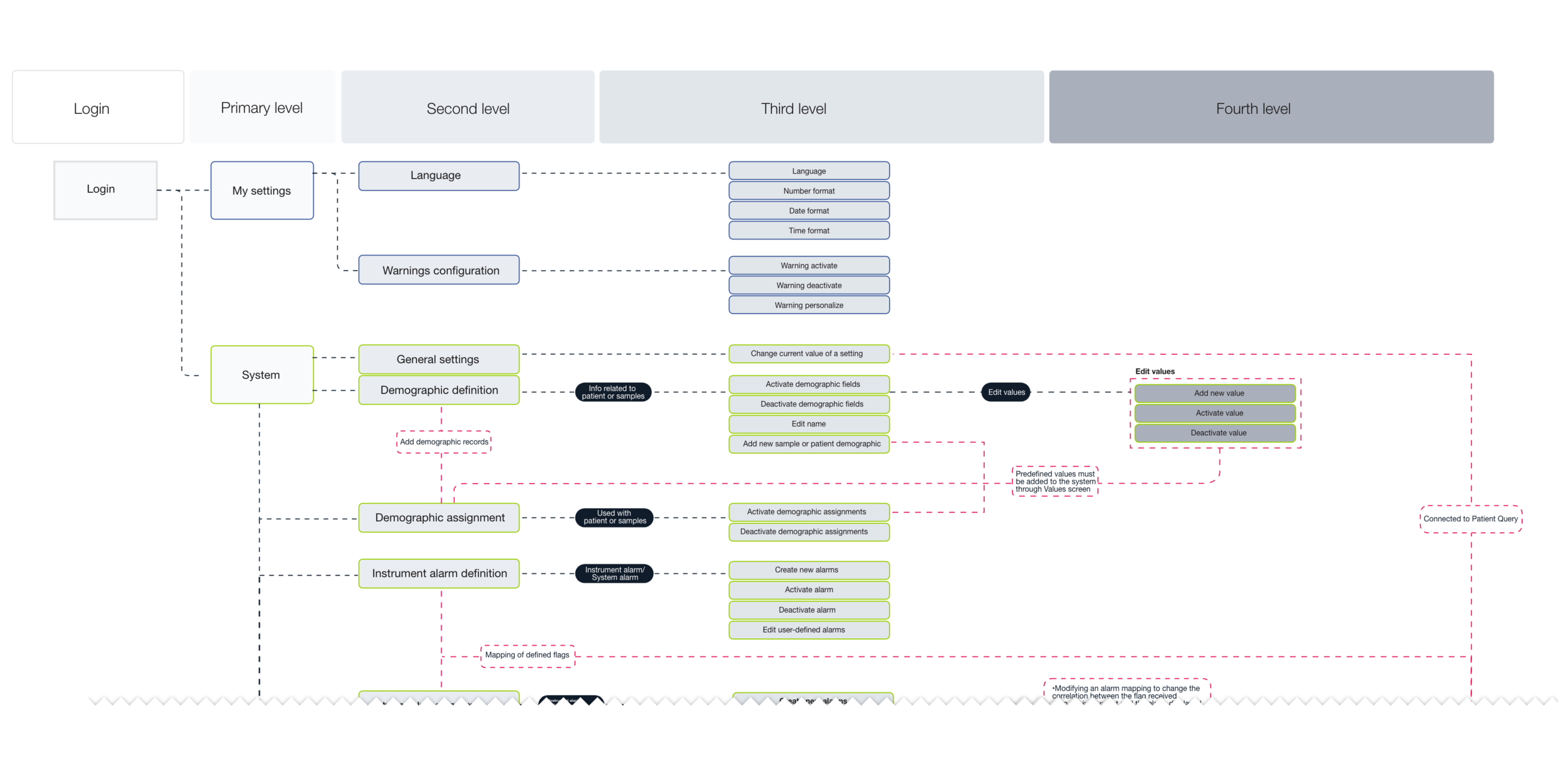
Existing workflows analysis

Example of user flow for a part of the application
User flows
After we had a clear picture of the existing functionalities and we took into account the voice of the users (through issues reported with the current software), we started thinking of how we might help the users with their challenges and if there is an opportunity to improve the user experience without creating major changes in the back-end implementation.
To support this activity, we started mapping the movement of the user throughout the application by creating user flows.
I was involved in analyzing the existing user flows, visualizing them and brainstorm discussions for new workflows.
Lo-fi prototyping
In the beginning, we used quick prototyping methods (low fidelity sketches, paper prototyping and sketches of the user flows) that enabled us to brainstorm features and solutions at a very fast pace. - also an inexpensive way to brainstorm and create multiple approaches to get feedback on.
We did multiple rounds of internal reviews and internal usability testing sessions to get a fresh perspective on the concepts and get more engagement from the development team by involving them in the design process.

Example of lo-fi prototyping in Balsamiq

*information has been blurred due to NDA
Hi-Fi prototyping
I turned the revised sketches into an interactive prototype done with AdobeXD. I defined UI elements, design patterns and visual hierarchy.
Together with my colleague, we did this as an iterative process in the preparation of the usability tests. We decided to have the high-fidelity approach for the user testing in order to create for the user a closer to reality, tangible and relatable experience.
Having an iterative approach to our concepts and designs, ideation sessions were conducted every week together with the business representative to constantly improve the workflows until usability tests were ready to begin.
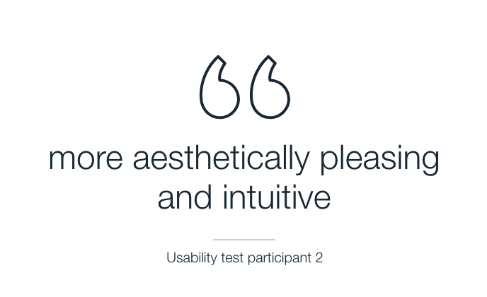
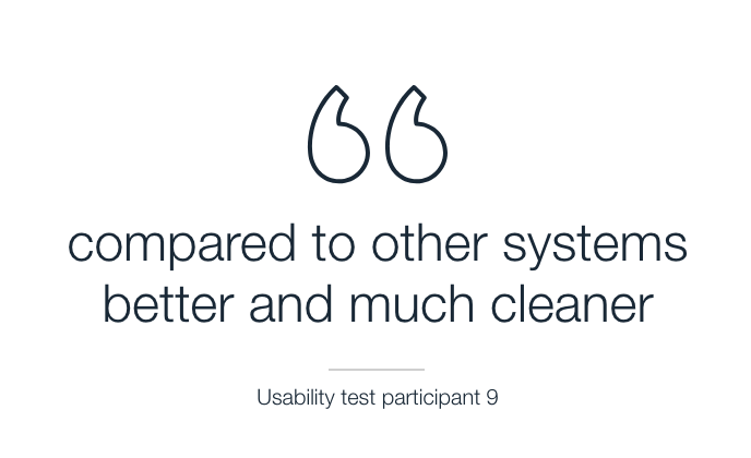
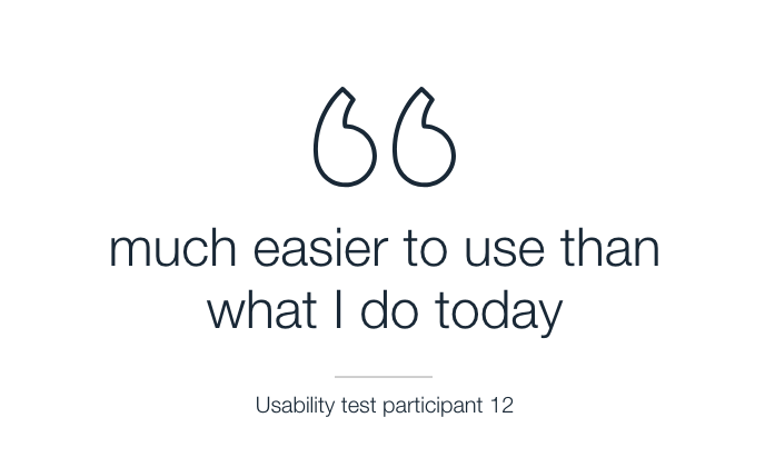
Usability testing
During these activities I was involved as either the Conductor of the Usability tests, or the Observer, depending on the context. After the usability tests, I documented the findings and analyzed the data so it can be shown in a clear way to the business-decisions makers.
User testing was done in different stages of the project. All of the usability tests were planned to take into account the main objective of the software: improving existing workflows and speed up the day-to-day job of our users.
Three types of supervised user testing were employed frequently:
• On-site prototype user testing of the upcoming releases relevant to POCCs and nurse educators - All workflows were tested with 15 users – different target country representatives - on a high-fidelity prototype adapted to the expected screen size of the user’s used device.
• User external validation testing after the product was developed - Higher risk or new workflows were tested on the real implementation with users from different countries
• Remote usability testing performed with Field Service Engineers before and throughout the development of Configuration functionality
Usability test session
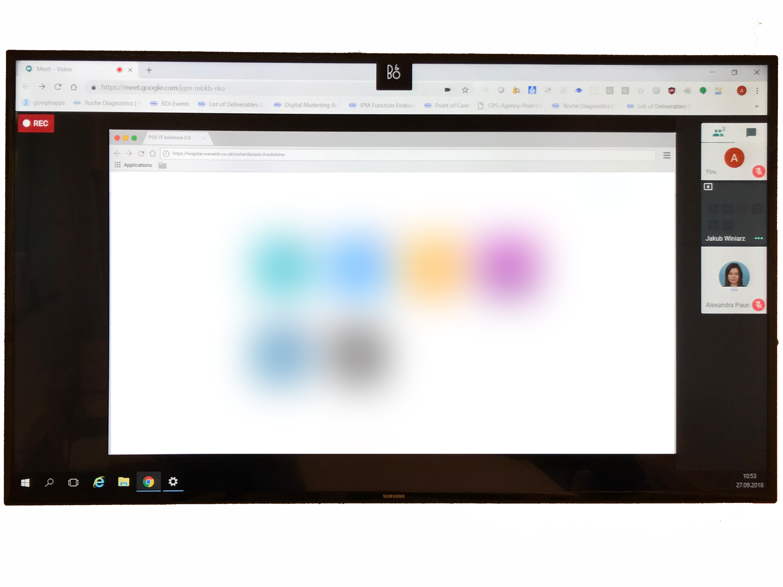
Remore usability testing - via Google Hangouts

External Validation
Iterations based on feedback
After a few usability tests we could verify the general data model and information architecture. Some of the findings include:
The display of inactive elements confused 92% of the users and made it more difficult to choose the right path, as they understood the non-clickable element as a clickable component and the way of solving the task.
Having a dashboard proved to be a very useful view for a point of care coordinator to see what is currently going on, however the feedback we received is that the users want a way of having more information displayed in the dashboard and therefore a more condensed view. It also took some more iterations to figure out how much and which information was most crucial to the user to see at first glance.
Users valued the positive feedback after the completion of each workflow action, as a trust builder.
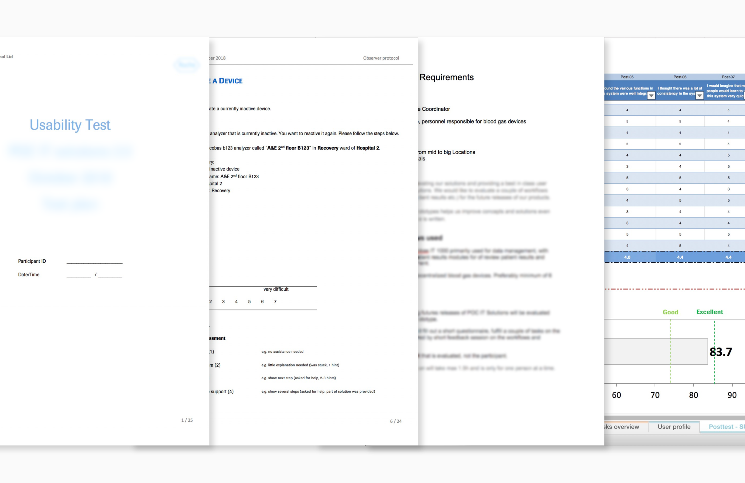
Usability tests documents: Observer protocol, Usability tests tasks, Usability tests requirements for participants and Usability tests analysis with an outcome of 83.7 result on SUS scale
UI Design
When I started working on this responsive application, the guidelines were in need of updating. Some of the concepts did not fit into a responsive modern design that the users and the business sponsors expected. Therefore, in addition to redesigning the product itself, we needed to come up with the foundations of a new design system for Roche.
The visual style guide and UI Kit that I created for this project, keeping in mind the corporate branding and the Google Material guidelines, was the starting point of the standardized Design System that is currently used by multiple projects across the organization. As of today after many iterations due to projects’ and users’ feedback the design system has been already applied in more than 10 other solutions across the company.
I designed the final screens with the aim of a clean, modern look (within the limitations of corporate and branding guidelines) that would help the users solve their tasks quickly.
The application is a “problem-solver” software, therefore colors support showing of the urgency of tasks.
The design is accessible and can be used for color-blind people. I designed as a starting point for the smallest screen size supported - the tablet one (1024x768px) - keeping in mind the responsiveness of the application for bigger screen sizes.
As shown, the new design of the application combined with the improved logic of the workflows had a major impact on the usability and ease-of-use.
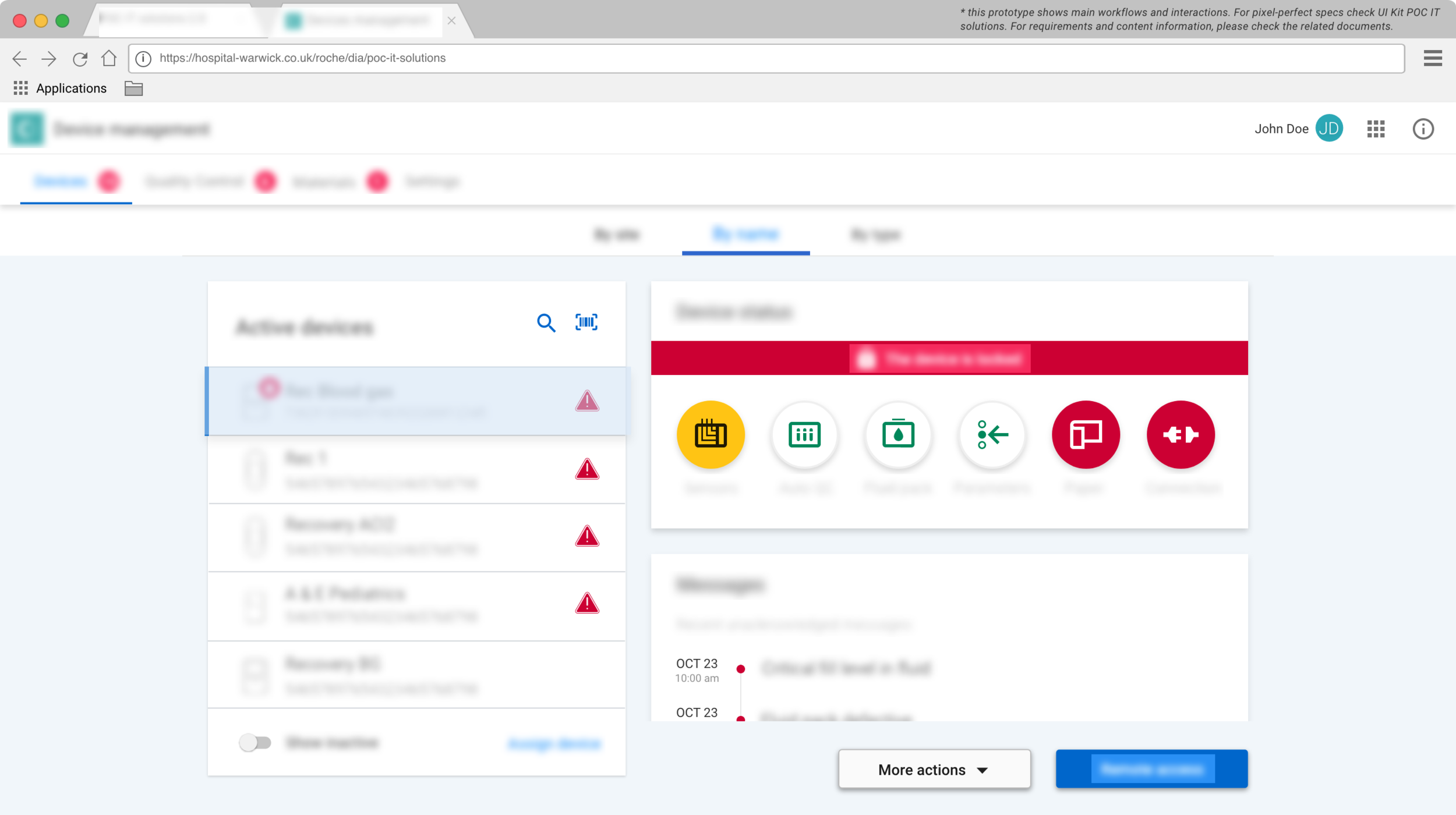
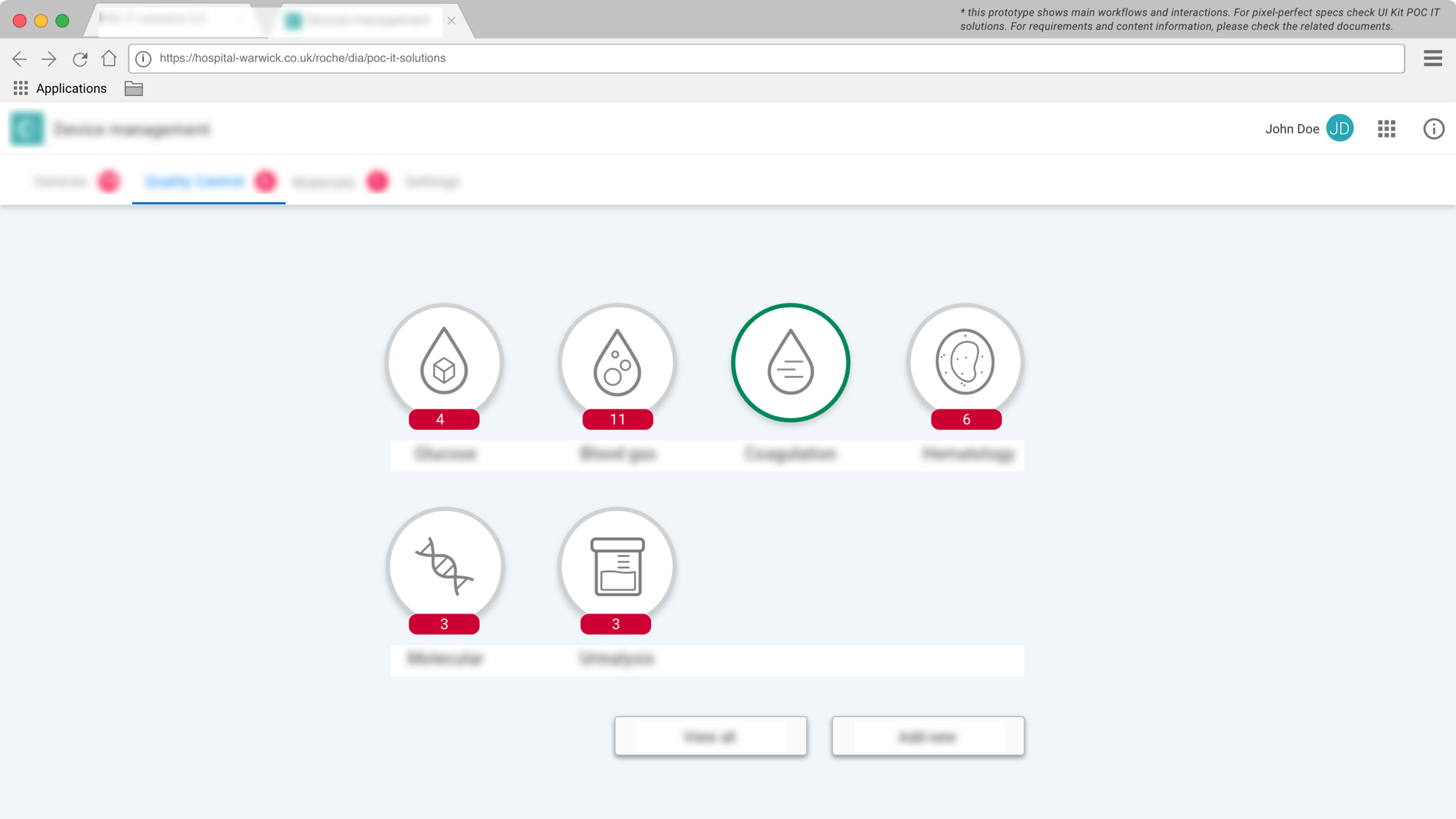
Final sample screens

*possible relevant information has been blurred as a result of the NDA
Delivery and implementation phase
After the concepts were finalized, tested and iterated based on the usability tests findings, the implementation of the project started in a Scrum set-up. I was involved in refinement meetings and planning sessions to discuss the UX concepts with the Scrum team.
I collaborated with Frontend Development Team to provide the UI specifications in the project’s UI Kit and to communicate the expected behavior and interaction of elements inside the application (Pixel-perfect specification were provided as shown below).
After each iteration, I performed a UX review of the application, to make sure the quality of the implementation stays within the expectations.


Project documentation
During the development of the project, official documentation of the ongoing progress and proof of compliance to international standards was needed.
From UX side, depending on the milestone, there were different deliverables to be expected: Use Error Analysis, Usability Engineering File, UX Expert Review, Storyboards, documentation of the Usability testing.
After I became the UX Strategy Lead of the project, I created and submitted the requested documents to support the achievement of project’s milestones.
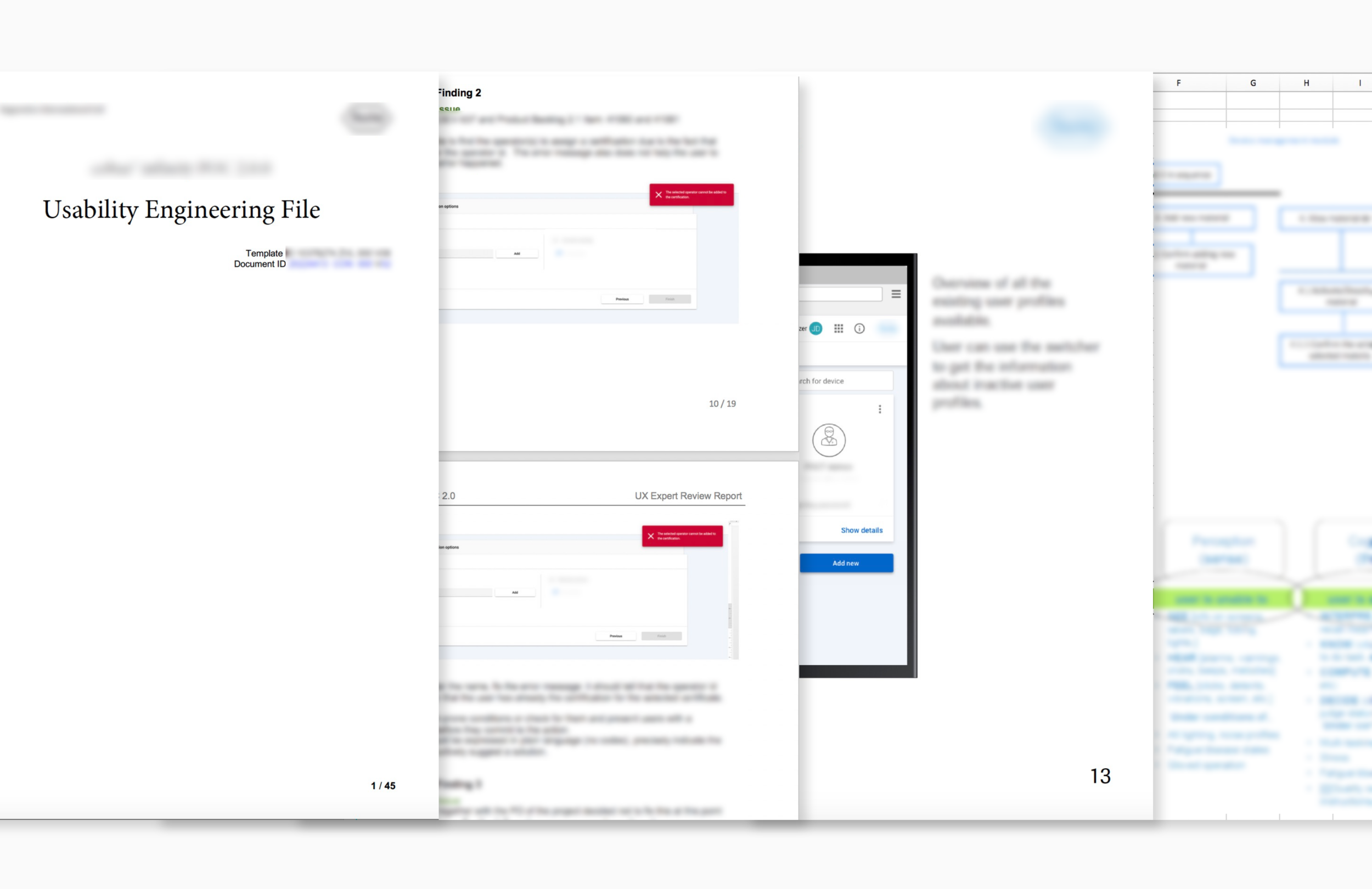
Usability Engineering File, UX Expert Review, Storyboard and Use error analysis
What did I learn from this project?
The user is always right (and you are not the user) – Conducting user testing and evaluating users’ feedback at various stages helped me discover and eliminate pain point at early stages.
Close collaboration with development team is a must – Being in close contact with developers helped me understand how they develop the interfaces and what they need in terms of UI specifications.
When you include people in the team in the process of concepting, they will feel closed to what will be developed and so more engaged