
Enhancement of off-boarding experiences
Improve users’ experience with 2 of the off-boarding processes in Spotify: cancelling an existing subscription and permanently closing an account
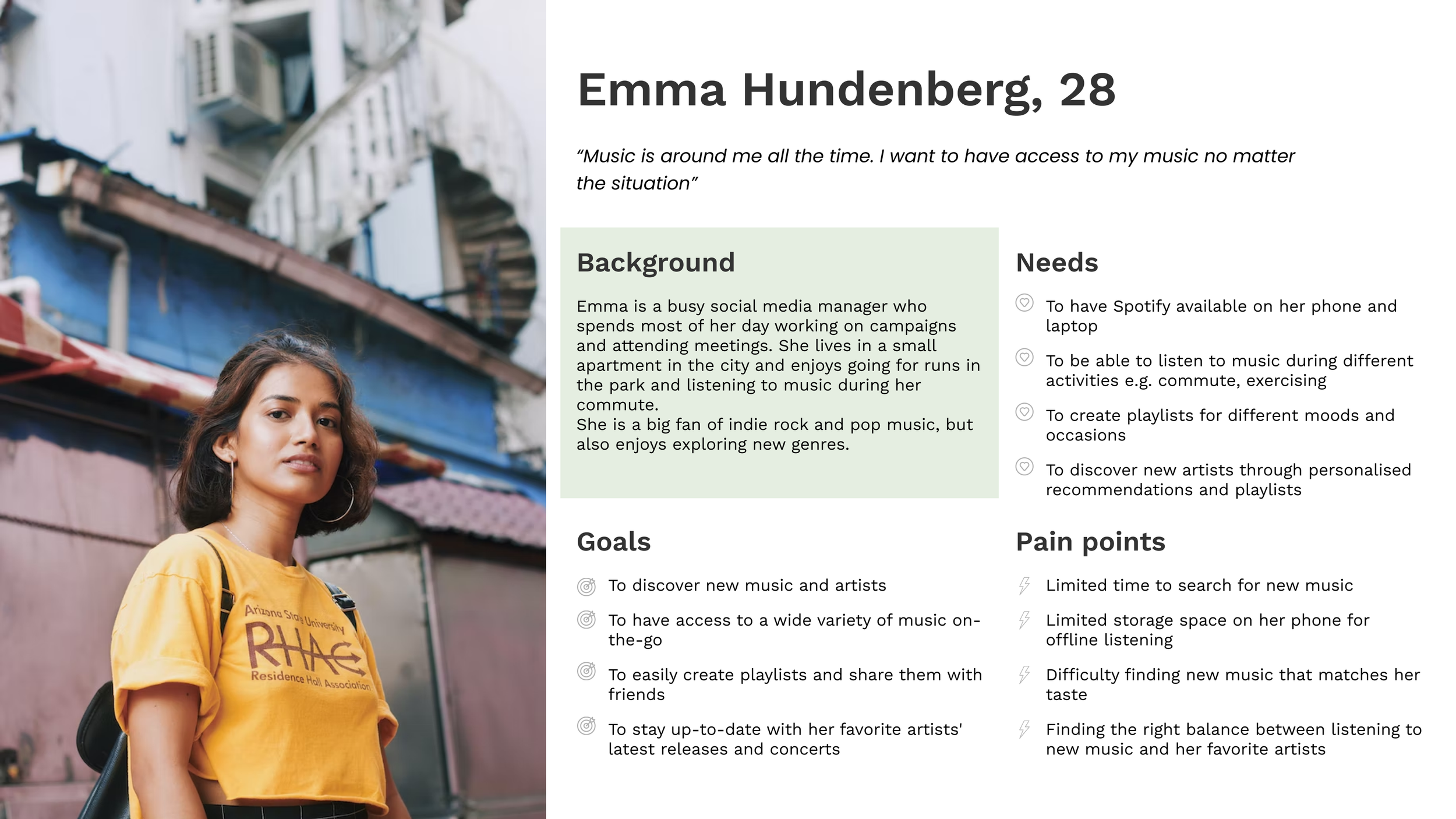
The challenge
I was the only designer in this project that was initiated as a product design exercise with the purpose of testing my problem solving techniques . The duration of this exercise was 2 days.
Spotify is a digital music, podcast, and video service that gives you access to millions of songs and other content from creators all over the world.
The challenge was to identify the possible problems in the workflow of off-boarding a user from Spotify and come up with proper improvements proposals in the form of wireframes and a hi-fi prototype, while having the specific time constraint.
Skills
Research / Interaction design / Visual design / Information architecture / Wireframing / Hi-Fi / Soft skills / Stakeholder management
Tools

The approach
The goal of this challenge was to make the experience of leaving the platform or cancelling a subscription smoother, therefore, my approach to reach the goal, as the only designer involved in the process, was as follows:
• Understand the user
• Understand the steps required for the 2 off-boarding flows
• Analyse the existing off-boarding flows of Spotify
• Execute desk research and check best practices in the practice of off- boarding in general
• Create the new User Flows
• Translate the flows into Wireframes
• Create a hi-fi clickable prototype
• Hold presentation for Stakeholders

My process
Day 1
Analize
Problem statement
Research
Persona
User journeys
User flows
Day 2
Inspire and create
Wireframes
Hi-Fi mockups
Prototype
Presentation
1 persona, 2 user journeys
For this part, with the limited time and resources I had, I had to work based on assumptions and answer some questions myself.
The persona was created with information gathered while doing the initial research. However, this is based on assumptions and it is worth specified that in a project with a wider timeline, the information would be gathered as a result of contextual inquiries and data analysis of the target persona group.
Existing User journey off-boarding experience 1
Cancelling a subscription

While cancelling a subscription, some of the pain points identified:
no clear visual communication of the advantages or usage of an existing subscription
finding the action to cancel a subscription is not easy
asking for confirmation of cancellation of subscription 3 times can create frustration
some of the visualisation is visually appealing, but doesn’t bring the user any value e.g. how much they used their subscription
Existing User journey off-boarding experience 2
Close an account

To close an account in Spotify, there are several steps with challenges:
the option of closing an account is not easy to find, hidden under multiple menus and creates frustration
not clear where the user is in the navigation structure
the navigation asks the user multiple times to choose the same action
steps are constantly repeating and the interaction jumps from one workflow to another, creating confusion for the user
Analyse best practices of off-boarding experiences

Desk research
In my creative process, I like gathering inspiration from best practices and also flows that don’t have the best experience, so that I know what is important to be integrated and what to be avoided.
In my research, I analysed how cancelling a subscription and closing an account work in different other companies.
I chose both web and mobile experiences of companies such as Facebook, Uber, Adobe Creative Cloud and LinkedIn.
Create the user flows
With all the information I gathered, I put together the flows with the enhanced functionality and usability.
Cancelling a subscription

enhanced functionality with possibility to pause a subscription
statistics of usage of subscription
show subscription’s benefits up-front
comparison between subscription and free account type
Closing an account

closing an account action showed up-front, next to profile details
option to pause an account
2-steps verification by choice: SMS or e-mail
feedback form
Wireframes
After agreeing on the functionality enhancements, i translated them into wireframes, with the purpose of check the flow and the way information will fit into the page.
Normally, this would be the step where I would organise usability tests with real users, to be able to verify the assumptions and check if there is anything that I missed or is not easy to understand.
Cancelling a subscription

Closing an account

*after developing the wireframes I did a quick feedback round with 1 user to check my assumptions. The result was that the user was concerned of having the feedback form before finishing the workflow. However, if the feedback form is after finishing a workflow, the probability of the user dropping the feedback round is much higher. For this decision, I would recommend usability tests with a proper number of participants and sync with business to understand priorities for this workflow.
Translate wireframes into Hi-Fi
Closing an account
Cancelling a subscription
Reflections
Reflection: what I would improve with an extra day
Ask the users for feedback up-front - understand the problem that I am trying to solve by hearing it from actual users
Iterate after having the wireframes with at least 5 users
Test the prototype and my assumptions with at least 5 users (e.g. should the feedback form be included in the cancellation workflow or after, is pausing subscription a desirable feature, does giving recommendations help for retentions of users)
Have an ideation workshop with the stakeholders
Take a more detailed look into the holistic experience of cancelling a subscription - also on mobile and tablet app
Do competitive analysis to compare the prices of subscriptions of the other music services