
Branding definition
Creating the branding vision and art direction of a hiking trail website
The challenge
I was the only designer in this project that was initiated as a branding exercise with the purpose of testing branding creation knowledge, design systems and art direction. The duration of this exercise was 4 days.
HikeUp is developing a website for helping tourists in finding the perfect trail for a hike and plan the whole experience around it.
With this project, the challenge was to find the branding direction that through visual representation speaks the same language as the target audience, organize it in a Design System and present it to stakeholders, while having a specific time constraint and only 2 wireframes as a starting point.
Skills
Branding design / Art Direction / Design Systems / Interaction design / Visual design / Information architecture / Hi-Fi / Soft skills / Stakeholder management
Tools

The approach
The goal of this challenge was to create a branding for a hiking trails website, therefore, my approach to reach the goal, as the only designer involved in the process, was as follows:
• Understand the target audience
• Define the brand attributes
• Execute desk research and gather visual inspiration
• Translate the brand attributes into concrete elements e.g. typography
• Create the Design System
• Translate the wireframes into Hi-FIs and adapt for mobile
• Test for accessibility
• Hold presentation for Stakeholders
My process
Day 1
Synthesise and scope
Problem statement
Define target audience
Define brand attributes
Day 2
Inspire and create
Research
Design System
Day 3
Visual Twists
High-Fidelity Mockups
Design System
Day 4
Fine tuning
Accessibility tests
Presentation
Identify target audience
For this part, with the limited time and resources I had, I had to work based on assumptions and answer some questions myself.
I had 6 questions to ask myself so that I can create a base from where to gather ideas for the website’s direction.
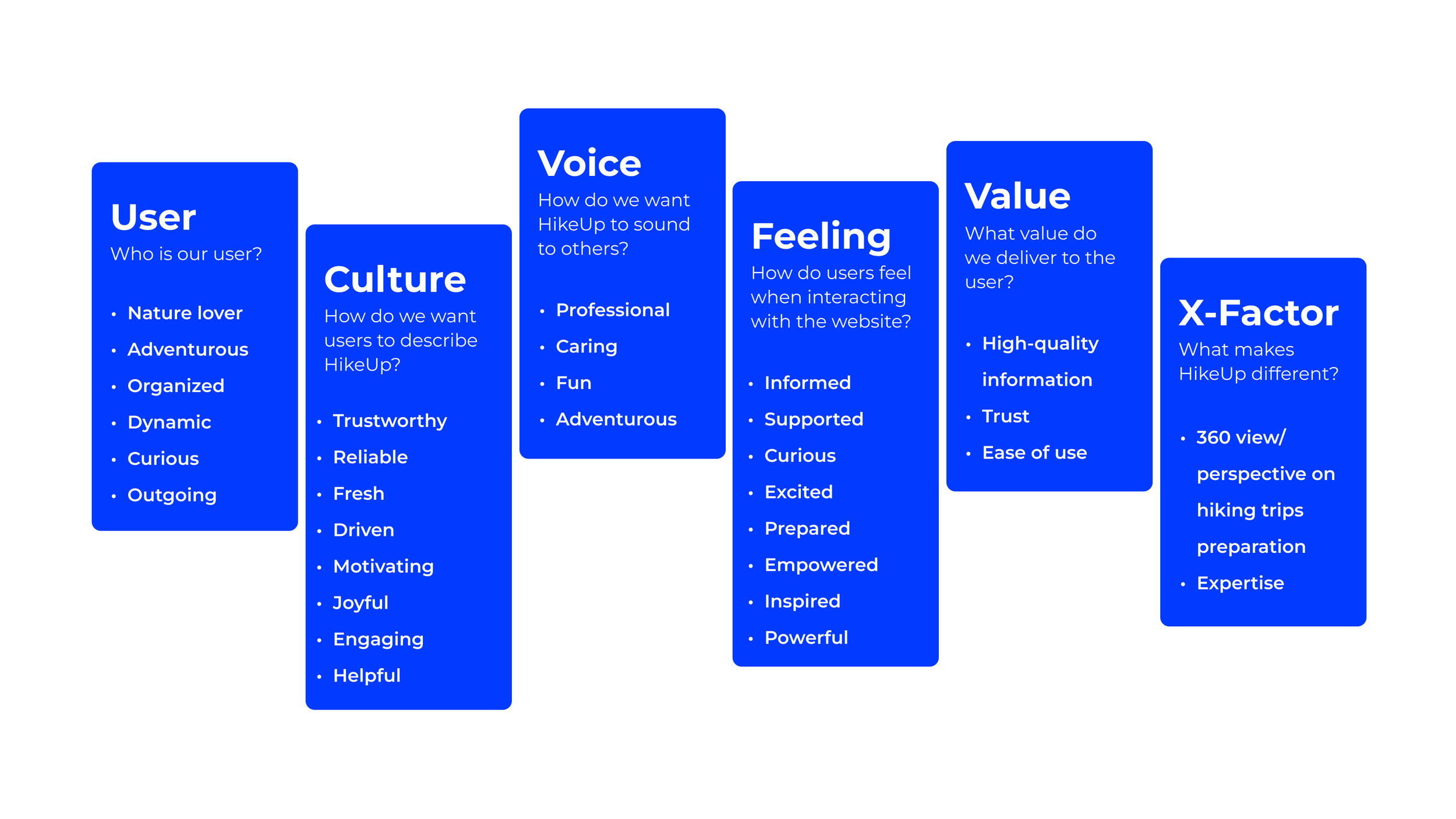
After this point, I would normally suggest organising a workshop with stakeholders. The purpose of this is to create alignment and agree transparently about what do we want the brand of HikeUp to transmit to its users. To do that, we would prioritise the terms that are the most important and agree with the people in the workshop on max. 5 attributes, through classification and voting sessions.
Why this 5 principles?
I found them to be the most powerful for the message I wanted to transmit with the website: “We’ll help you get where you want to be” by inspiring you with trails and ideas and empowering you to chase those ideas while encouraging you to take bold risks.
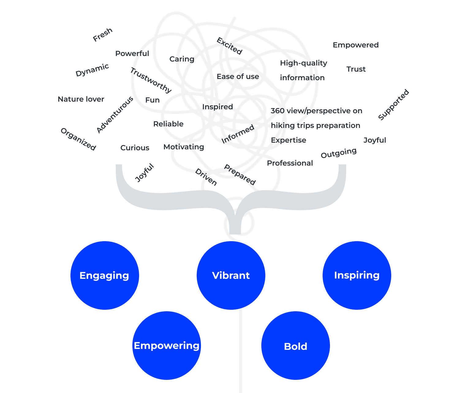
Translate principles into UI elements

Desk research
In my creative process, I always start with gathering inspiration and opening my mind for creativity, out-of-the-box thinking and new ideas.
The inspiration I gather serves as littles pieces of the puzzle - fonts, colours, patters.
e.g. given that this website was for a specific location - Zermatt, Switzerland - I looked for inspiration in the canton flag or city of Zermatt flag

How I got pieces of inspiration from my research
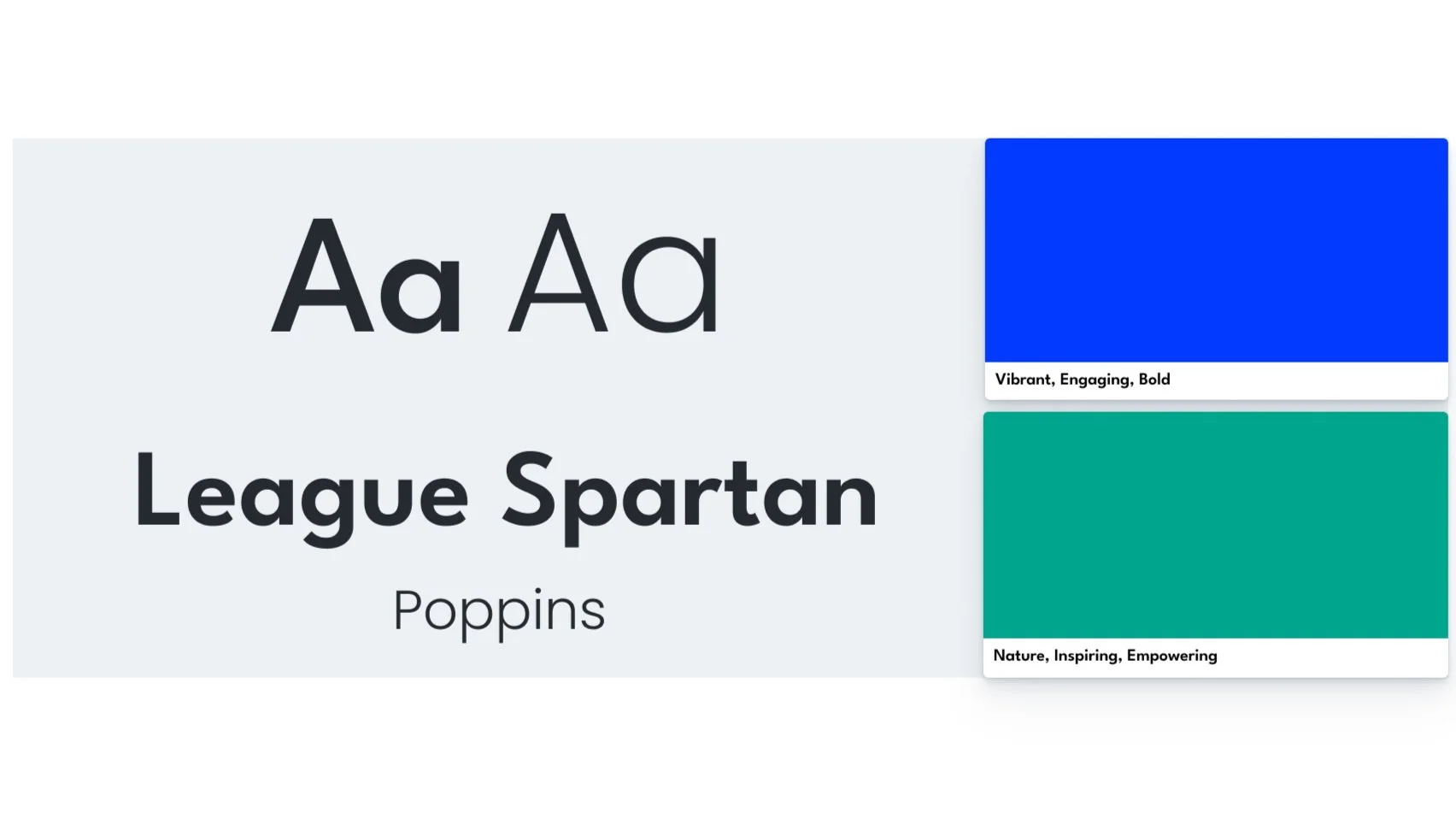
Establish typography and colours
Typography
I wanted a font type that can communicate the main message in a bold way, something modern, combined with a clean, playful, easy to read one.
The choice of sans-serif fonts came for 2 reasons: support the 5 principles and have a font that works well in small sizes (for body text or diminutive web copy).
Colours
What’s the first thing that comes to mind when thinking about nature? Green! However, when thinking about Zermatt, it comes to mind an image about a snowy mountain, therefore the choice of colour blue.
To support the 5 principles, I chose vibrant colours, more saturated and with more light.
On top of that, in the psychology of colours, blue stands for depth, trust, confidence, calm and green for balance, nature, safetiness. In terms of accessibility, they are easy to distinguish colours.
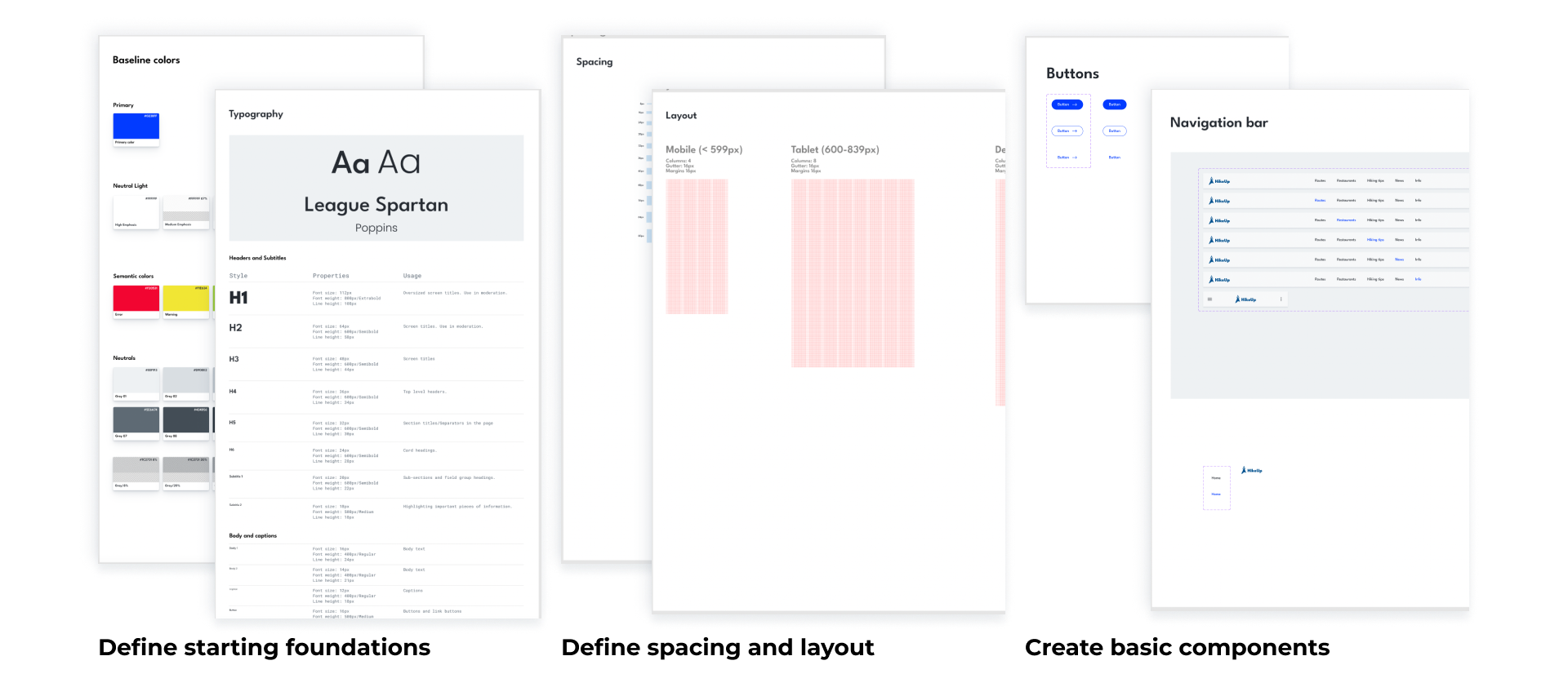
Create a Design System
I started structuring my Design System from the basics: font hierarchy, colours, icons, layout grids, spacings and navigated towards the components that could be noticed already in the wireframes: buttons, navigation bar, cards.
As the Design System is a living organism, I continued to adapt and iterate the initial elements of the Design System as I was designing the screens, to fit my needs.
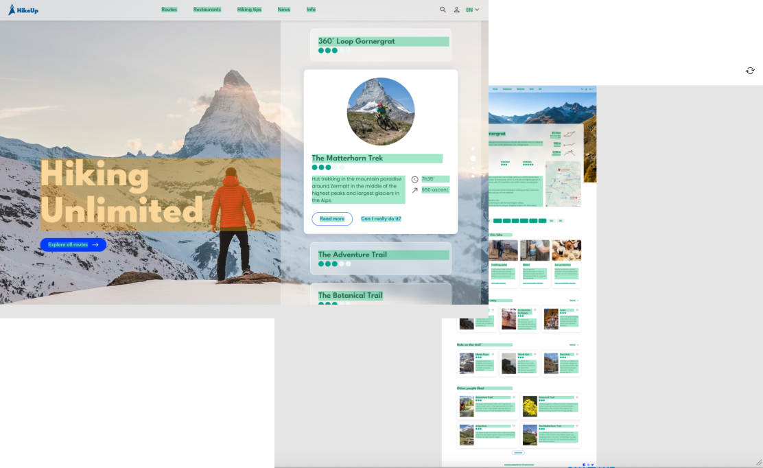
Translate wireframes into Hi-Fi
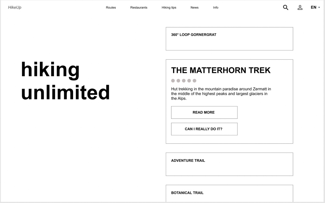
Before - wireframe 1
To help me design the screens, i had to ask myself some questions: What message do I need to convey to the user?, Why did the user come on this page?, What actions do I want them to take?, What emotions do I want to create?
I added some elements to facilitate the usability:
a call to action button to inspire the user to check more info on the website
Glassmorphism to offer a dynamic design language to a dynamic component with a minimalistic style
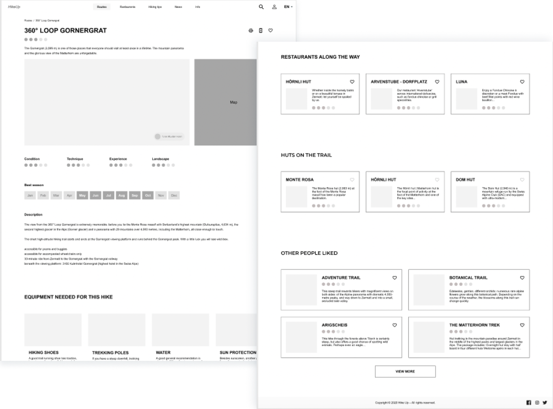
Before - wireframe 2

After - Hi-Fi visualisation
a button for more information on the card - helps the user make a decision on what they want to focus on
subtle stepper to help the user understand how much they have to scroll on the slider

After - Hi-Fi visualisation
Accessibility tests
For both contrast ratio and colour blindness conditions I used a Figma plugin.
Contrast ratio AA - the big title scored a bit lower in the accessibility plug-in, however, I took the decision to keep it like that, given that I thought the suggestion from the plug-in interferes with the readability

Colour blindness simulation: Deuteranomaly and Protanopia
Learning and reflections
Reflection: what I would improve with an extra day
Ask users for feedback on the 2 screens/general visual direction: colours, feelings
Add accessibility tests on each colour in the design system
Check layers’ names in Figma to ensure consistency
Create the mobile version of the homepage
Improve the logo
Think about a concept that allows the user to create a hiking folder in their profile with all the information they need related to a specific trail in order to plan the whole adventure rigorously
Learnings
When starting a Design System from scratch, with no previous elements in the platform, it is a given that the components will have to be adjusted multiple times to adjust the needs of your designs
Being organised in the Figma file makes a difference when you have to iterate on a design multiple times
Research done in the beginning of the creative process helps to have a better approach in design